Photoshop skills task
3 November
L.O. to use and develop creative techniques in photoshop
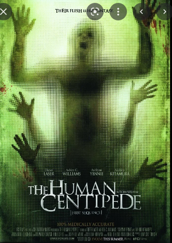
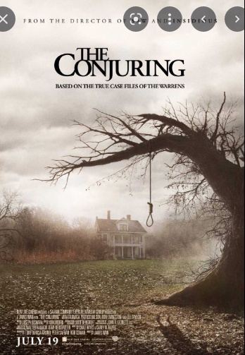
Things horror film posters have in common. For example, they all have things that connote scariness like a black red and white colour palete or blood or weapons.We also see something that plays a significant part in the film, like a character or location or object. A lot of block capitols are also used in the title too.
my horror poster
colour palette: greys blacks blues maybe greens.
information: release date, title, maybe a tagline, main image,
ideas: de-realisation, 2 blended images (gradient tool), close up of face , scared/ crying, block capitols,
these fonts:
- Typewriter fonts
This is my horror poster. I enjoyed making this poster and had to rush a bit at the end so didnt look exactly how i would like, but i am still pleased with this.
WWW: i think this connotes a lot of elements of a horror poster and looks pretty good.
EBI: i finished it amnd maybe matched the photos or blended them better.


Great work Matilda
ReplyDeleteWWW: you've included all of the main elements of a horror poster
EBI: think about the size and placement of your elements